How to Lower Bounce Rate on Website: Optimizing for Mobile Usability
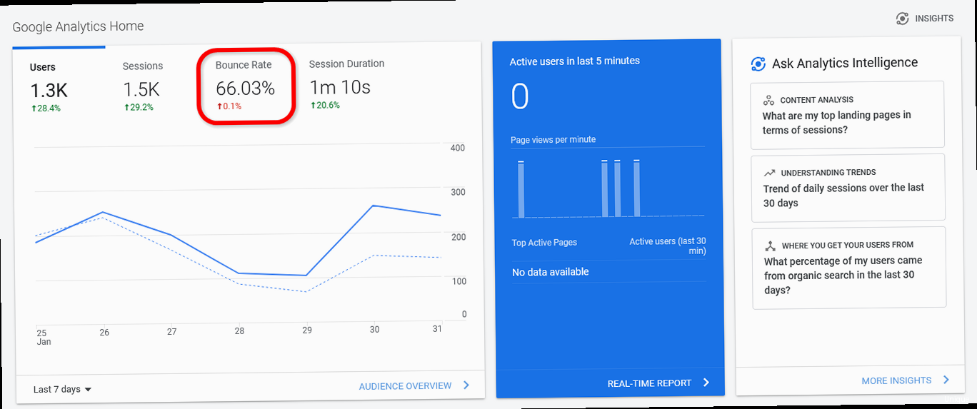
A high bounce rate can signal to search engines that your website isn’t meeting user expectations, negatively impacting your SEO. While many factors contribute to bounce rate, poor mobile usability is a frequent culprit. In this article, we’ll dive deep into practical strategies for optimizing your website’s mobile experience, directly addressing common issues that drive visitors away and significantly reducing your bounce rate.
- Prioritizing Mobile Page Speed
- Implementing a Truly Responsive Design
- Optimizing Content for Mobile Consumption
- Designing Touch-Friendly Navigation and UI
- Avoiding Intrusive Mobile Interstitials
Prioritizing Mobile Page Speed

Image Optimization
Images often represent the largest portion of a webpage’s size. Compressing images and serving them in modern formats like WebP can dramatically reduce load times. Example 1: Using `cwebp` for WebP conversion:cwebp -q 75 image.jpg -o image.webpMinifying CSS, JavaScript, and HTML
Minification removes unnecessary characters (whitespace, comments) from your code, reducing file sizes without affecting functionality. Example 1: Using UglifyJS for JavaScript minification:uglifyjs script.js -o script.min.jsLeveraging Browser Caching
Browser caching allows browsers to store static assets (images, CSS, JavaScript) locally, reducing the need to download them on subsequent visits. Example: Configuring browser caching using .htaccess (Apache):<FilesMatch ".(ico|pdf|flv|jpg|jpeg|png|gif|swf)$">
Header set Cache-Control "max-age=2592000"
</FilesMatch>
<FilesMatch ".(css|js)$">
Header set Cache-Control "max-age=604800"
</FilesMatch>
<FilesMatch ".(html|htm)$">
Header set Cache-Control "max-age=600"
</FilesMatch>
Implementing a Truly Responsive Design

Fluid Grids and Flexible Images
Fluid grids use relative units (percentages) instead of fixed units (pixels) to define element widths, allowing them to scale proportionally with the screen size. Flexible images also scale to fit their containers. Example: CSS for a fluid grid layout:.container {
width: 90%; /* Percentage-based width */
margin: 0 auto;
}
.column {
width: 48%; /* Percentage-based width */
float: left;
margin-right: 2%;
}
.column:last-child {
margin-right: 0;
}
img {
max-width: 100%; /* Image scales to fit container */
height: auto;
}
@media (max-width: 768px) {
  .column {
    width: 100%; /* Columns stack on smaller screens */
    float: none;
    margin-right: 0;
  }
}
Mobile-First Approach
The mobile-first approach involves designing your website for mobile devices first and then progressively enhancing it for larger screens. This ensures that the core functionality and content are optimized for mobile users from the outset. Example: Structuring your CSS with mobile-first principles:/* Default styles for mobile */
body {
font-size: 16px;
}
/* Media query for larger screens */
@media (min-width: 769px) {
body {
font-size: 18px;
}
}
Viewport Meta Tag
The viewport meta tag controls how the browser scales the webpage on different devices. It’s crucial for ensuring that your website is displayed correctly on mobile devices. Example: Including the viewport meta tag in your HTML:<meta name="viewport" content="width=device-width, initial-scale=1.0">
Optimizing Content for Mobile Consumption
Mobile users often have different needs and expectations than desktop users. They’re typically looking for information quickly and efficiently. Optimizing your content for mobile consumption involves making it easy to scan, read, and interact with. This includes using shorter paragraphs, larger fonts, clear headings, and bullet points to break up text.Concise and Scannable Text
Write shorter paragraphs and use clear, concise language. Break up long blocks of text with headings, subheadings, bullet points, and images to make the content more scannable. Example: Rewriting a paragraph for mobile readability: Original paragraph: “The implementation of a robust content strategy is paramount to achieving sustainable growth in today’s dynamic digital landscape. Organizations must prioritize the creation and distribution of high-quality, engaging content that resonates with their target audience and effectively communicates their brand message. This requires a deep understanding of audience needs, a commitment to consistent content creation, and a data-driven approach to content optimization.” Revised paragraph: “Want sustainable growth? Focus on your content! Create high-quality, engaging content that speaks to your audience. Understand their needs, create consistently, and use data to optimize.” The revised paragraph is shorter, uses simpler language, and is easier to scan.Font Size and Readability
Use a font size that is large enough to be easily readable on mobile screens. Ensure sufficient contrast between the text and background colors. Example: Setting font size and line height in CSS:body {
font-size: 16px; /* Minimum recommended font size for mobile */
line-height: 1.5; /* Improves readability */
color: #333; /* Dark gray for good contrast */
}
Optimizing Images and Videos
Use high-quality images and videos that are optimized for mobile devices. Compress images to reduce file sizes and use responsive video embeds that adapt to different screen sizes. Example: Using the <picture> element for responsive images:<picture>
<source media="(max-width: 768px)" srcset="image-small.jpg">
<source media="(min-width: 769px)" srcset="image-large.jpg">
<img src="image-default.jpg" alt="Description of the image">
</picture>
Designing Touch-Friendly Navigation and UI
Mobile users interact with websites using touch, not a mouse cursor. This requires careful consideration of the size and spacing of interactive elements, such as buttons, links, and form fields. Touch-friendly navigation and UI elements are essential for providing a seamless and intuitive mobile experience.Button Size and Spacing
Make buttons large enough to be easily tapped with a finger. Ensure sufficient spacing between buttons to prevent accidental taps. Example: CSS for touch-friendly buttons:.button {
display: inline-block;
padding: 12px 24px;
font-size: 16px;
border-radius: 5px;
margin: 10px; /* Spacing between buttons */
min-width: 44px; /* WCAG recommendation for touch target size */
min-height: 44px; /* WCAG recommendation for touch target size */
}
Simplified Navigation Menus
Use a clear and concise navigation menu that is easy to access and navigate on mobile devices. Consider using a hamburger menu or a bottom navigation bar for smaller screens. Example: Implementing a hamburger menu using HTML, CSS, and JavaScript: HTML:<nav class="mobile-nav">
<div class="hamburger">
<div class="line"></div>
<div class="line"></div>
<div class="line"></div>
</div>
<ul class="nav-links">
<li><a href="#">Home</a></li>
<li><a href="#">About</a></li>
<li><a href="#">Services</a></li>
<li><a href="#">Contact</a></li>
</ul>
</nav>
.mobile-nav {
  display: flex;
  justify-content: space-between;
  align-items: center;
  padding: 20px;
}

.hamburger {
  display: block;
  cursor: pointer;
}

.line {
  width: 25px;
  height: 3px;
  background-color: #333;
  margin: 5px;
}

.nav-links {
  display: none; /* Initially hide the menu */
  list-style: none;
  padding: 0;
  margin: 0;
}

.nav-links li {
  margin-bottom: 10px;
}

.nav-links a {
  text-decoration: none;
  color: #333;
  font-size: 18px;
}

/* Show menu when hamburger is clicked */
.mobile-nav.active .nav-links {
  display: block;
}
const hamburger = document.querySelector('.hamburger');
const mobileNav = document.querySelector('.mobile-nav');

hamburger.addEventListener('click', () => {
  mobileNav.classList.toggle('active');
});
Form Field Optimization
Optimize form fields for mobile input by using appropriate input types (e.g., `type=”email”` for email fields, `type=”tel”` for phone number fields) and providing clear labels and instructions. Example: Using appropriate input types and labels:<label for="name">Name:</label>
<input type="text" id="name" name="name">
<label for="email">Email:</label>
<input type="email" id="email" name="email">
<label for="phone">Phone:</label>
<input type="tel" id="phone" name="phone">
Avoiding Intrusive Mobile Interstitials
Intrusive mobile interstitials, such as full-screen ads that block content, can be extremely annoying for mobile users and are penalized by search engines. Avoiding these types of interstitials is crucial for providing a positive user experience and maintaining good search rankings. While interstitials can be effective for certain purposes, it’s important to use them sparingly and in a non-intrusive way.Types of Intrusive Interstitials
Examples of intrusive interstitials include:- Full-screen ads that cover the main content and require the user to close them.
- Pop-up ads that appear unexpectedly and disrupt the user’s flow.
- Standalone interstitials that users must dismiss before accessing the main content.
Alternatives to Intrusive Interstitials
Consider using these less intrusive alternatives:- Banners: Place small, unobtrusive banners at the top or bottom of the page.
- In-content ads: Integrate ads seamlessly within the content, ensuring they don’t disrupt the reading experience.
- Delayed pop-ups: If you must use a pop-up, delay its appearance until the user has spent a certain amount of time on the page or scrolled to a specific point.
- Exit-intent pop-ups: Show a pop-up only when the user is about to leave the page.
Google’s Mobile-Friendly Guidelines
Google penalizes websites that use intrusive interstitials that make it difficult for users to access content on mobile devices. Adhering to Google’s mobile-friendly guidelines is essential for maintaining good search rankings. Example: Ensuring compliance with Google’s mobile-friendly guidelines: Before implementing any type of interstitial, test it using Google’s Mobile-Friendly Test tool to ensure that it doesn’t violate their guidelines.https://search.google.com/test/mobile-friendly
person
Article Monster
Email marketing expert sharing insights about cold outreach, deliverability, and sales growth strategies.