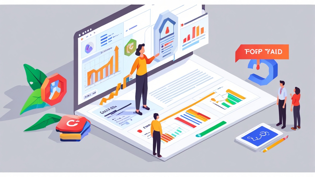
How to Increase Conversion Rate with Google Ads: Optimizing Landing Page Experience
Google Ads can be a powerful engine for driving traffic to your website, but simply attracting clicks isn’t enough. Converting those clicks into paying customers is the ultimate goal. This article focuses specifically on optimizing the landing page experience to dramatically improve your Google Ads conversion rates. We’ll delve into practical strategies, actionable examples, and proven techniques to ensure your landing pages are not just visually appealing, but also highly effective at turning visitors into conversions.
Table of Contents
- Improve Landing Page Speed: The Foundation of Conversions
- Matching Ad Intent: Aligning Ads and Landing Pages
- Crafting Clear Calls to Action: Guiding Visitors to Convert
- Mobile Optimization: Capturing the Mobile Audience
- A/B Testing: Continuously Refining for Peak Performance
Improve Landing Page Speed: The Foundation of Conversions

Leveraging Browser Caching
Browser caching allows visitors’ browsers to store static assets like images, CSS files, and JavaScript files locally. This significantly reduces load times on subsequent visits, creating a smoother and faster experience. Properly configuring browser caching is essential for improving page speed. Example 1: Configuring Browser Caching in .htaccess (Apache)<IfModule mod_expires.c>
ExpiresActive On
ExpiresByType image/jpeg "access plus 1 year"
ExpiresByType image/png "access plus 1 year"
ExpiresByType image/gif "access plus 1 year"
ExpiresByType image/svg+xml "access plus 1 year"
ExpiresByType text/css "access plus 1 month"
ExpiresByType application/javascript "access plus 1 month"
ExpiresByType application/x-javascript "access plus 1 month"
ExpiresByType text/html "access plus 1 hour"
</IfModule>
http {
  ...
  server {
    ...
    location ~* \.(jpg|jpeg|png|gif|svg|css|js)$ {
      expires 365d;
    }
    ...
  }
}
Optimizing Images for the Web
Large, unoptimized images are a major culprit behind slow page load times. Optimizing images involves compressing them without sacrificing too much visual quality and serving them in the appropriate format (e.g., WebP for modern browsers). Example 3: Using Image Optimization Tools Several tools can help you optimize images, including:- TinyPNG/TinyJPG: Online tools for compressing PNG and JPG images. They use lossy compression techniques to reduce file size significantly.
- ImageOptim (macOS): A free, open-source image optimization tool that supports various image formats and compression algorithms.
- ShortPixel: A WordPress plugin that automatically optimizes images as you upload them. It offers both lossy and lossless compression options.
- Squoosh: A web app by Google that allows you to compress and convert images using various codecs. It offers granular control over compression settings.
Minifying CSS, JavaScript, and HTML
Minification removes unnecessary characters (whitespace, comments) from your CSS, JavaScript, and HTML files, reducing their size and improving load times. While the reduction per file may seem small, the cumulative effect across all files on your page can be significant. Example 4: Using a CSS Minifier Many online tools and build processes can minify your CSS. A simple example using an online tool like CSS Minifier (many are available through a simple Google search):- Copy your CSS code into the input area.
- Click the “Minify CSS” button.
- Copy the minified CSS code from the output area and replace your original CSS code.
npm install -g terser
terser input.js -o output.min.js
“Website speed is critical for online success. A slow website can kill your business.” Dr. Jakob Nielsen, Nielsen Norman Group
Matching Ad Intent: Aligning Ads and Landing Pages

Keyword Relevance: The Foundation of Alignment
The keywords you target in your Google Ads campaigns should be prominently featured on your landing page. This signals to both users and Google that your page is highly relevant to their search. However, keyword stuffing should be avoided; instead, focus on naturally incorporating keywords into your content. Example 1: Keyword Integration in Headline and Body Copy Let’s say you’re running an ad campaign targeting the keyword “affordable web design services.” Your landing page headline should incorporate this keyword: Bad Example (Unrelated Headline): Welcome to Our Website! Good Example (Keyword-Rich Headline): Affordable Web Design Services – Get a Quote Today! The body copy should also naturally include the keyword and related terms. For example: “Looking for affordable web design services? We offer professional website design solutions tailored to your budget. Our team of experienced designers will create a stunning website that represents your brand and helps you achieve your business goals. Contact us today for a free consultation and learn more about our affordable web design packages.”Ad Copy Consistency: Delivering on Promises
Your landing page must deliver on the promises made in your ad copy. If your ad promises a free trial, make sure the landing page prominently features the free trial offer and provides a clear path to sign up. If your ad highlights a specific product or discount, the landing page should directly showcase that product or discount. Example 2: Matching Ad Copy with Landing Page Offer Ad Copy: “Get 20% Off All Shoes – Limited Time Offer!” Bad Landing Page (Generic Product Page): A landing page showing all product categories with no mention of the 20% discount. Good Landing Page (Dedicated Offer Page): A landing page showcasing shoes with a clear banner highlighting the 20% discount and a prominent call-to-action to “Shop Now and Save 20%.” The landing page should automatically apply the discount to the shopping cart when a user adds shoes.Tailoring Content to Specific Ad Groups
For optimal results, create dedicated landing pages for each ad group in your Google Ads campaigns. This allows you to tailor the content and messaging to the specific keywords and themes within each ad group, resulting in a more relevant and personalized experience for users. Example 3: Creating Dedicated Landing Pages for Ad Groups Let’s say you’re selling project management software. You might have two ad groups:- Ad Group 1: Targeting keywords like “project management software for small business”
- Ad Group 2: Targeting keywords like “enterprise project management software”
- Landing Page for Ad Group 1: Focuses on the benefits of your software for small businesses, highlighting features like ease of use, affordability, and scalability.
- Landing Page for Ad Group 2: Focuses on the benefits of your software for large enterprises, highlighting features like advanced reporting, security, and integration with other enterprise systems.
Crafting Clear Calls to Action: Guiding Visitors to Convert
A clear and compelling call to action (CTA) is essential for guiding visitors towards conversion. Your CTA is the instruction that tells users what you want them to do next, whether it’s signing up for a free trial, requesting a quote, making a purchase, or downloading a resource. A weak or confusing CTA can leave visitors unsure of what to do, leading them to abandon your page without converting. A well-crafted CTA, on the other hand, can significantly improve your conversion rates by providing a clear and enticing path forward.Action-Oriented Language: Encouraging Clicks
Use action-oriented language that clearly communicates the desired outcome of clicking the CTA. Avoid generic phrases like “Submit” or “Click Here.” Instead, use more specific and compelling phrases that resonate with the user’s needs and motivations. Example 1: Improving Call-to-Action Text- Bad CTA: Submit
- Better CTA: Get Started Now
- Best CTA: Start Your Free Trial – No Credit Card Required
- Bad CTA: Click Here
- Better CTA: Learn More
- Best CTA: Discover the Benefits
- Bad CTA: Sign Up
- Better CTA: Create Your Account
- Best CTA: Join Our Community – It’s Free!
Visual Prominence: Making Your CTA Stand Out
Your CTA should be visually prominent and easily noticeable on your landing page. Use contrasting colors, ample whitespace, and strategically placed buttons to draw attention to your CTA. Ensure that the button size is appropriate for both desktop and mobile devices. Example 2: Designing Visually Appealing CTAs- Color Contrast: Use a color that contrasts sharply with the background color of your landing page. For example, if your background is white, use a bright color like orange, green, or blue for your CTA button.
- Whitespace: Surround your CTA button with ample whitespace to prevent it from getting lost in the surrounding content. This will help draw the user’s eye to the button.
- Button Size and Shape: Ensure your CTA button is large enough to be easily clicked, especially on mobile devices. Use a clear and recognizable button shape (e.g., rounded corners).
- Placement: Place your CTA in a prominent location on your landing page, such as above the fold (visible without scrolling) or at the end of a persuasive section of content.
Placement and Context: Putting Your CTA in the Right Spot
The placement of your CTA should be strategic and contextually relevant. Place your CTA near key information or benefits that encourage users to take action. Consider using multiple CTAs on longer landing pages, ensuring that users always have a clear path to convert. Example 3: Strategic CTA Placement- Above the Fold: Place a CTA above the fold to capture the attention of visitors as soon as they land on your page. This is particularly effective for simple offers or sign-up forms.
- After a Benefit Section: After highlighting the key benefits of your product or service, place a CTA to encourage users to take the next step. This helps reinforce the value proposition and motivate conversion.
- At the End of a Testimonial Section: After showcasing positive testimonials from satisfied customers, place a CTA to build trust and encourage potential customers to convert.
- On Long Pages: Use multiple CTAs throughout a long landing page to ensure that users always have a clear path to convert, regardless of where they are on the page.
Mobile Optimization: Capturing the Mobile Audience
With the majority of internet traffic now originating from mobile devices, optimizing your landing pages for mobile is no longer optional – it’s essential for maximizing your Google Ads conversion rates. A poorly optimized mobile landing page can frustrate users, leading to high bounce rates and missed opportunities. Mobile users have different needs and expectations than desktop users, so it’s crucial to create a mobile-friendly experience that caters to their specific context.Responsive Design: Adapting to Different Screen Sizes
Responsive design is a web design approach that ensures your landing page adapts seamlessly to different screen sizes and devices. This means that the layout, content, and images automatically adjust to provide an optimal viewing experience, regardless of whether the user is on a desktop computer, a tablet, or a smartphone. Example 1: Implementing Responsive Design with CSS Media Queries CSS media queries allow you to apply different styles based on the characteristics of the device, such as screen width, height, and orientation./* Default styles for larger screens */
body {
font-size: 16px;
}
.container {
width: 960px;
margin: 0 auto;
}
/* Styles for screens smaller than 768px (e.g., smartphones) */
@media (max-width: 768px) {
body {
font-size: 14px;
}
.container {
width: 100%;
padding: 0 15px;
}
}
Mobile-First Content: Prioritizing Essential Information
Mobile users often have limited attention spans and are looking for information quickly. Prioritize essential information and present it in a concise and easy-to-digest format. Use short paragraphs, bullet points, and clear headings to make your content scannable. Example 2: Optimizing Content for Mobile Desktop Content: “Our comprehensive project management software offers a wide range of features, including task management, collaboration tools, reporting dashboards, and integration with other popular business applications. With our software, you can streamline your workflows, improve team communication, and gain valuable insights into your project performance. We offer flexible pricing plans to suit your specific needs.” Mobile Content: “Project Management Software:- Streamline workflows
- Improve team communication
- Gain valuable insights
Touch-Friendly Navigation and Forms: Ensuring Usability
Mobile users interact with your landing page using touch gestures, so it’s crucial to ensure that your navigation and forms are touch-friendly. Use large, easily tappable buttons and links, and optimize form fields for mobile input. Example 3: Optimizing Forms for Mobile- Use large input fields: Make sure the input fields are large enough to be easily tapped on a mobile device.
- Use appropriate input types: Use the correct input type for each field (e.g., `type=”email”` for email fields, `type=”tel”` for phone number fields). This will trigger the appropriate keyboard on mobile devices, making it easier for users to enter information.
- Minimize the number of fields: Only ask for essential information. The fewer fields a user has to fill out, the more likely they are to complete the form.
- Use clear labels: Ensure that each field has a clear and concise label that tells the user what information is required.
<form>
  <label for="name">Name:</label><br>
  <input type="text" id="name" name="name" required><br><br>

  <label for="email">Email:</label><br>
  <input type="email" id="email" name="email" required><br><br>

  <label for="phone">Phone:</label><br>
  <input type="tel" id="phone" name="phone"><br><br>

  <input type="submit" value="Submit">
</form>
A/B Testing: Continuously Refining for Peak Performance
A/B testing, also known as split testing, is a powerful method for continuously improving your landing page conversion rates. It involves creating two or more versions of a landing page element (e.g., headline, CTA, image) and showing each version to a different segment of your audience. By tracking the performance of each version, you can identify which one performs better and implement the winning variation. A/B testing is an ongoing process of experimentation and refinement that helps you optimize your landing pages for peak performance.Identifying Key Elements to Test
Not all elements on your landing page are created equal. Focus your A/B testing efforts on the elements that are most likely to impact your conversion rates. Some key elements to test include:- Headlines: Test different headlines to see which one resonates most with your target audience.
- Call-to-Actions: Experiment with different CTA text, colors, and placements.
- Images: Test different images or videos to see which ones are most engaging and persuasive.
- Form Fields: Test different form layouts and field requirements.
- Page Layout: Experiment with different page layouts and content arrangements.
Using A/B Testing Tools
Several A/B testing tools are available to help you create, run, and analyze your tests. Some popular options include:- Google Optimize: A free A/B testing tool integrated with Google Analytics.
- Optimizely: A comprehensive A/B testing platform with advanced features.
- VWO (Visual Website Optimizer): Another popular A/B testing platform with a user-friendly interface.
- AB Tasty: A personalization and A/B testing platform.
- Create an Account and Install the Optimize Snippet: Set up a Google Optimize account and install the Optimize snippet on your landing page. This is typically done by adding a code snippet to the `` section of your HTML.
- Create a New Experiment: Create a new experiment in Google Optimize, specifying the landing page you want to test.
- Create Variations: Create variations of the landing page element you want to test (e.g., headline, CTA). You can use the visual editor to make changes to the page.
- Set Objectives: Define your experiment objectives (e.g., increase conversion rate, reduce bounce rate).
- Configure Targeting: Configure targeting options to specify which users should see the different variations. You can target users based on factors like location, device, and browser.
- Start the Experiment: Start the experiment and let it run until you have enough data to reach statistical significance.
- Analyze Results: Analyze the results of the experiment to determine which variation performed better. Google Optimize will provide you with statistical data to help you make a decision.
Interpreting Results and Implementing Changes
Once you’ve collected enough data, it’s time to analyze the results and implement the winning variation. Ensure that the results are statistically significant before making any changes. Statistical significance indicates that the observed difference between the variations is unlikely to be due to random chance. Example 3: Interpreting A/B Testing Results Let’s say you ran an A/B test on your CTA button text.- Version A (Original): “Learn More” – Conversion Rate: 2%
- Version B (Variation): “Get Started Now” – Conversion Rate: 3%
Article Monster
Email marketing expert sharing insights about cold outreach, deliverability, and sales growth strategies.